We are living in the greatest age of board gaming, ever. There are more options, opportunities, and innovations in the market than has ever existed. That is not to say that bigger (or more) is always better or anything like that. Consider, however, the shift in the way the board game industry has been seen in the broader media since the hallowed days when Settlers of Catan was first brought into the world. Euro-games were a thing as far back as the 1970. But Settlers of Catan came to the world in 1995, and opened a market for such things in the United States.
The changes that have come as a result range from the supremely subtle to the positively profound. How subtle? Prior to Settlers of Catan, for example, how many board games can you recall had the name of the designer on the box? How profound? Check out some of the multi-million dollar campaigns for big box games with so many miniatures you… well, you get the idea.
Almost 30 years later, thanks to such early pioneers and the avalanche of information that comes with the Internet, we have things like BoardGameGeek, Kickstarter and Gamefound. We have companies like Print & Play which specialize in helping you get your game printed—either as a pre-publication copy or as your publishing partner.
Yes, it is a true renaissance of board gaming! But…
Although we have had tools that help us navigate the world of board games for many years, and some of them are the keystones that have bolstered the industry, they have their issues. Let’s look at two of these platforms with an eye toward how they can be improved.
BoardGameGeek
Problem #1—math: there are places where the math on BoardGameGeek does not add up. The most obvious place is in the collection summary. This is mine, for example:

This page says I have 480 owned board games, and 273 owned board game expansions. This is a lie. What I own are 207 games and 273 expansions. For some reason, it is a known issue that the board game count includes board game expansions… so they are counted twice.
This is not the only place where the front end is used in ways that misrepresent the database.
Solution—arithmetic: Someone needs to do a page-by-page analysis of the front end and correct all of these places where the numbers are not showing what they should. Also, the way this page is organized is not really efficient. The same table could be used with a column for core games, a column for expansions, and column for accessories, and then a column for totals. Something needs to happen here.
Problem #2—geekmail: the interface for GeekMail is… well, let’s just say it is quirky. Each operation (delete, archive, etc.) seems to behave differently depending upon where you are. Sometimes things just do not make sense.
I am not suggesting that they create a fully featured GMail replacement, but one could argue that trying to mimic a traditional email look, feel, and operation would be an improvement.
Solution—think like email: When revamping this system each button, link, line of data, etc. should be looked at as though this were a traditional email system. Granted, it is entirely internal to BoardGameGeek, but the look and feel should seem like it works the way most people would expect such a system to operate.
Problem #3—there are things that the editor needs: There are two things that I feel the BoardGameGeek editor (be that for messages or the forums) needs:
- Lists (bulleted or numbered)
- Tables
People have used dashes to set up lists, they have used images of die faces, and so on. None of them look very good. Making a bullet list or a numbered list should not require the user to use work-arounds and kluges to get the job done.
People often try to use monospaced fonts to make tables, but even that is a pain within the BoardGameGeek editor. Being able to create simple tabulated data should not be as difficult as it is.
Solution—two functions, just two little functions: how hard can it be to add ordered/unordered lists, and simple tables? Not sure… I have not seen their code-base, but I do believe it should be done. And right soon.
Kickstarter
Problem #4—the search is too broad: Kickstarter is the OG of crowdfunding platforms. The sheer number of games that have gone through there prompted the creation of Gamefound—a crowdfunding platform dedicated to games. Kickstarter, in my opinion, has a lot to learn.
If you go to Kickstarter and hover over Games near the top of the screen, you are shown a breakdown of the types of games you can look for. One of the options is Tabletop Games.

The problem is that when you select Tabletop Games, you are shown a lot of things. These range from board games to role-playing games to miniature or terrain collections (or even just the STL files for them) to … well, you get the idea.
Solution—another layer of filters: When you get into the search criteria, you can tell the search engine to limit the results to a particular location; you can also tell it how to sort that data. There are filters for some things, but none of these will help you in removing the chaff from the wheat.
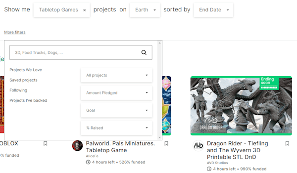
What we need is a way to filter on particular areas of the tabletop gaming experience. I would like to see sub-categories like:
- Role-playing Games
- Board Games
- Miniatures
- STL Files
- RPG Accessories
- Board Game Accessories
- Dice
I truly believe it would make navigating the whole jungle that is the search results a lot easier.
Problem #5—my backed projects page needs an overhaul:
I am a superbacker. I have no idea how many backed projects it takes to get to that point, but I am there. As I write this, I have two active projects and 126 successful projects listed on my Backed Projects page.
First things first: the layout of these tables is terrible. We have an image that is too small to matter, a title column that can easily wrap into four or more lines, a status column that almost never has anything in it, several columns on which you can sort that have dubious results (i.e., pledged amount sorts on the monetary symbol and the number), and so on.

All of these are things that need to be addressed. As it stands, this table is far more useless than it should be. That said, my biggest problem is the bloat. As I said (and as it indicates above), I currently have 126 projects in that list. The vast majority of those are projects that have completed (meaning I do not need to look at them any longer) or projects that will never deliver (meaning I do not need to look at them any longer). I really want an option to mark a project as archived. An archived project is still in the database, but does not show up on this list. There would then be a button or link to show me the archived projects I have.

Solution—completely revamp this page: While they are at it, they can move the unsuccessful pledges off the page and put them behind a similar button or link. In all the time I have been on Kickstarter, I have never had a use for that section of the page. I am sure somebody finds this useful. But a simple drop down at the top of the page that allows me to look at Active, Successful, Unsuccessful, or Archived pledges would make this a much cleaner interface.
Problem #6—accountability: The site needs some way of holding people accountable when they fail to deliver on their promises. This could be something as simple as a warning on a page when a creator is running a campaign that shows how many campaigns they have run that reached their funding goal and failed to deliver to the backers.
I am certainly not opposed to some other method. From preventing people from running a campaign while another is still active, to a myriad of other choices. Something needs to be done.
Solution—something… anything: I have two methods listed above. I am sure that someone at Kickstarter has an idea on how this can be improved.
The Deming Wheel
Are there other issues? Sure! And some of them are far more important than the ones I bring up here. But the ones I am listing are the low-hanging fruit. These are ones that, if implemented, would show that something is being done in the background that is meant entirely for the betterment of the user experience.
Do you use BoardGameGeek? Kickstarter? If so, what elements of the User Interface bug you? What would you say are the first things you would want to see addressed?


