
Voltron. The Spider-Man movies. Robert Downey Jr’s film career. Everyone loves a good makeover. Entertainment brims with treasures of our past that are given new life through modern revision. Musicians are “getting the band back together” to do reunion tours featuring the latest sound and light displays. Blockbuster films and popular TV shows are remade with updated film techniques and special effects. When it comes to these art forms, it seems there is a question that pulls at our collective consciousness; “how can we make this better so even more people will enjoy it?” It was only a matter of time before this trend would hit the board game hobby. And it seems like makeovers are largely succeeding.
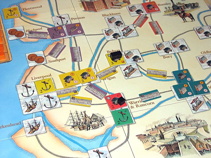
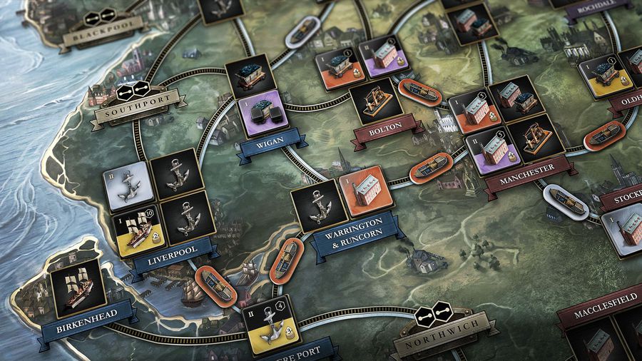
Brass by Martin Wallace recently had a very successful Kickstarter campaign and is already arriving in the hands of eager backers. Although it had earned great praise in its original release, Roxley games wisely decided to give it all-new artwork and tweak some minor design choices. The resulting campaign gained over $1.3 million USD and almost 13,700 backers. That represents a large number of new fans to the game that might otherwise have passed. Personally, I had friends that said they were now interested in playing because it looked so much better.
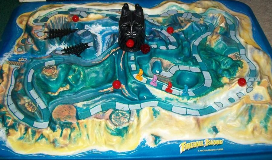
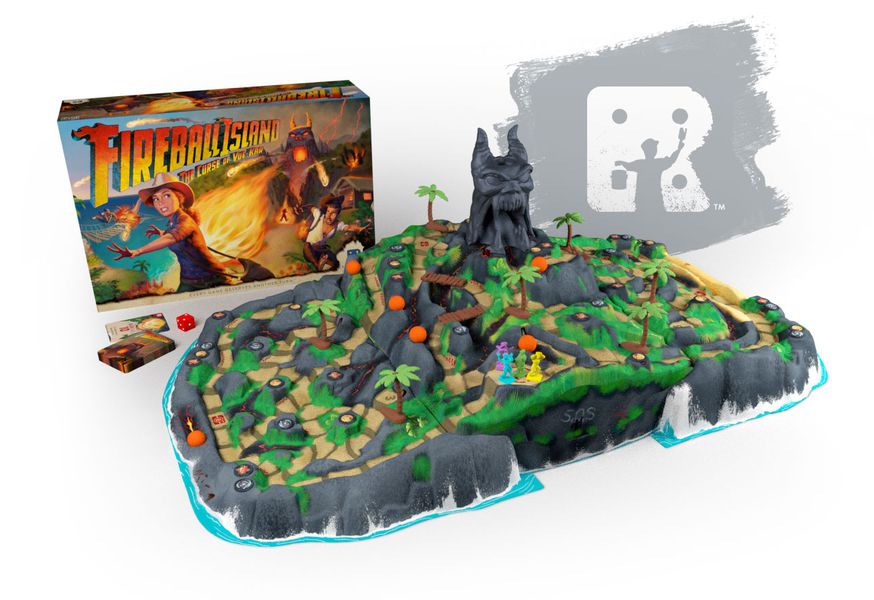
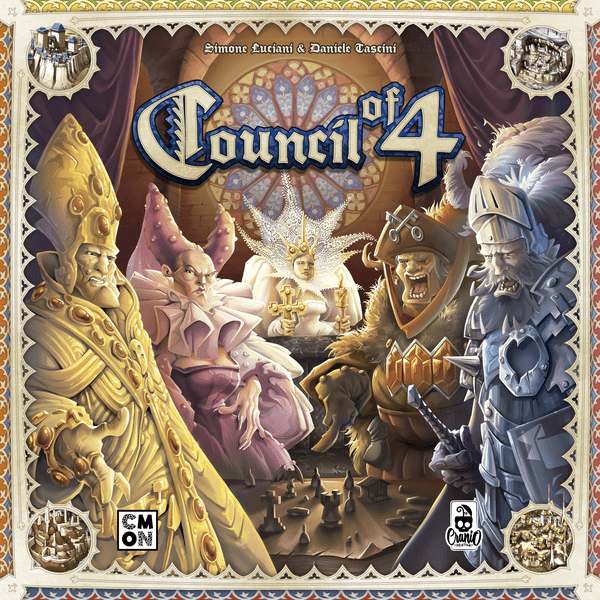
Other recent examples include Stephenson’s Rocket with art and design by the superb Ian O’Toole, Firenze which is on a Kickstarter run as of the date of writing, and CMON’s release of Council of 4, which now features eye-candy colors and plastic miniature opulence. Even the recently released The Game already received the makeover treatment, transforming the dreary black cards into family-friendly works of art by Kwanchai Moriya. And let’s not forget that Restoration Games’ entire model is built around giving new life to board game gems, such as the recent Kickstarter campaign for Fireball Island which only made $2.8 million USD.
These makeovers have me thinking, “What games would I love to see get the makeover treatment?” Like your favorite starlet on the CW, I believe that if these games got a facelift, they’d not only garner continued endearment of current fans, but would reach legions of new fans as well.
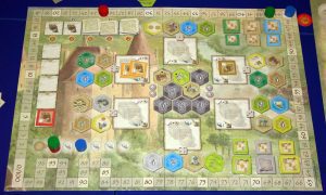
Castles of Burgundy
The concerns:
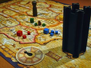
This Stefan Feld classic has no trouble being a hit with just about any gamer. The mechanics are solid and stand the test of time. The components? Not so much. The player mats and hexagonal tokens are sliced deli-thin. And the art desperately needs revision and extra color. I’ve heard many gamers refer to this as their favorite “ugly” game to play. While I won’t go as far to say it’s ugly, that is significant feedback from gamers that squarely lands Castles of Burgundy as the first game on my list.
The makeover:
First, beef up the player mats and cardboard components. Thicker tiles would add a nice tactile flourish and add to the “city building” theme. The player boards could be re-colorized to feel less muted and given a 2-layer recession so that the tiles hold in place. I’d love to see the art on the tiles, the central board, and the player board reworked so they don’t have a “pencilled watercolor” look. Decrease the amount of greys and browns. And finally, let’s fix that scoring track with the bizarre zig-zag between 84-100 that makes it obvious they ran out of room when delineating the spaces.
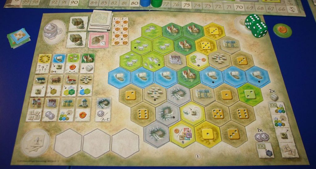
El Grande
The concerns:
My heart breaks every time I see a list of the “best territory control” games and El Grande isn’t on that list. First published in 1995, El Grande’s mechanics still stand strong compared to similar games today. I feel if anyone plays this, they will be surprised by the strategic options presented through the mixture of hand-management, card-action selection, and deployment options. I cannot say enough positive things about the game design from the mechanics standpoint. The art design? Well we have come a long way since 1995, haven’t we? The board and cards are monochromatic brown and prohibit new gamers from giving it a favorable look.
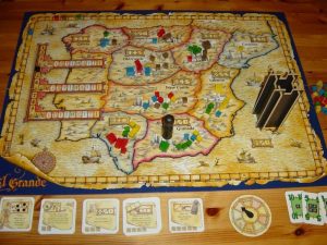
The makeover:
The original art is supposed to look like rustic maps and parchment for the board and cards. I like that concept for this game, but it can still be updated for modern gamers. Tone down the brown tones and add some color in the map and cards. You could give the cards some more artwork. The wooden cubes work fine, but if you really wanted to bling it out, you could turn the cubes into soldier type minis (I just made every euro die-hard groan). I also think the cardboard tower is fine, but it could be updated to look a bit more interesting than a Kubrickian black monolith.
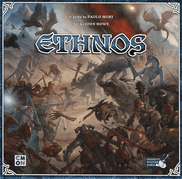
Ethnos
The concerns:
The first of two relatively newer releases on this list, Ethnos is a warmly received game published by CMON. Ethnos is a very accessible game for all types of gamers, and the rules and mechanics are simple and clear. What’s not so clear is the art direction for this game. There are a number of issues with the board and components.
First, the box shows this amazing picture of fantasy creatures locked in battle. The exterior looks exciting and engaging. But the card art by John Howe (who was the artist on a number of Lord of the Rings themed games) feels too serene. The same creatures you just saw on the box cover are all just kind of…standing there. There is no action or drama in the character poses. The Wizards look kind of bored. The Wingfolk and Merfolk are in the same exact position holding polearms to the side, evoking their best My Chemical Romance emo pose. Taken outside the board game context, Howe’s art is detailed and estimable. But in the context of everything else it’s not cohesive.
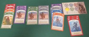
Second, the map is a tracing of the country Slovakia. Even though the map tries to fool us by presenting it as an island (Slovakia is landlocked) it nonetheless is an exact duplication. The art on the map aims for a realistic topographical style that also feels a bit bland. My third issue is that the map and card attempts at “high fantasy stoicism” juxtapose the component coloration. You’ve got muted blues, reds, purples, and greens on the territory lines of the map and on the cards, which clash with the neon colored plastic territory control discs for the players. I’m assuming they needed to differentiate player colors from territory and card colors, but it still doesn’t coalesce.
The makeover:
CMON is known for big, bold games with amazing art and dazzling color schemes. The Ethnos makeover should play to CMON’s strengths. Ethnos should go full-force-fantasy. Let’s start with the board. Turn it into a unique land filled with brilliant tones and varied topography. I’d even insert hints on the map where each creature could naturally call “home.” I envision the creature art on the cards looking more akin to the style of Council of 4 or Victorian Masterminds. Bright, somewhat cartoonish, but deadly looking creatures engaged in battle poses on their cards. They should look like they’re engaged in battle if this is a territory control game! For player, territory, and card colors, I’d actually lean more toward the colors of the current neon-styled player tokens. They’re fine if they stick to the same color palette.
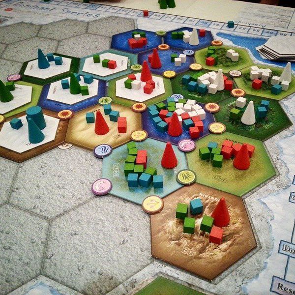
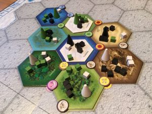
Dominant Species
The concerns:
This 2010 release by GMT Games is a challenge because I have found I don’t enjoy it. However, a big part of that is due to the fact that the art is so sterile. If I’m playing a 6-hour long game (yes, that happened), please give me something to look at. It’s fine to play a science-themed game, but I don’t want to feel like I just sat through science class. GMT Games are not known for their artistic style and appreciated for their straightforward minimalism. But a game about real animal survival and extinction could be much more thrilling if care were given to the surrounding aesthetics.
The makeover:
Aside from the mechanical things I’d fix (that’s an entirely different article, folks) this one needs some life in two key areas; the tiles and the board. Yes, I’m fine with the wooden cubes, cones, and discs. The board is simply a giant beige blob with hex outlines that players overlay with monochromatic non-descript tiles. As of now the terrain tiles evoke not much more than “light green,” or “dark green.” The mountain tiles look more like a mud pit. The tiles should be detailed to capture the distinctive wild terrain that the embattled creatures inhabit. To round out the board, give some new graphic design to the action selection area so it feels less like a prototype and captures the drama of various creatures fighting for survival. Finally, let’s title the game with a custom font and not the same font used for all neighborhood Halloween parties. The horror!
HeroQuest
The concerns:
In 1989 Milton Bradley (of all companies) unleashed the legendary HeroQuest to the masses. This fantasy board game brought the basics of Dungeons & Dragons to life by using a modular board and highly detailed 3D components like tables, bookshelves, benches, treasure chests and more. Games Workshop partnered to produce top-of-the-line miniatures for its time. Featuring a moderately long campaign in which up to 4 players could cooperate against a dungeon master, HeroQuest was the precursor to most of the dungeon crawl epics we enjoy today. So what’s the problem? It’s been out of print too long! If this game was brought back with some minor touches it would make a dragon’s hoard of gold.
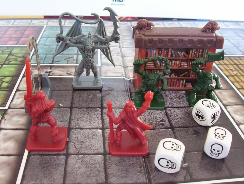
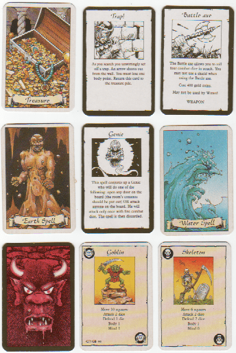
The makeover:
Not much. It just needs to be more available once again. Seeing the explosive success of Fireball Island’s reprint makes this a no-brainer. The roll and move mechanic is the only thing that is a little dated, and could use a more creative approach for movement. The rest stands up remarkably well at the present time. Maybe update the monster, treasure, and spell cards with immersive full-color artwork. Keep the box art though as it’s one of the most iconic board game boxes of all time. In addition to updating the cards, I’d expand the armory to include new items, weapons, spells, and armor. It did get a bit stale buying the same gear every campaign. This remake could also include entirely new campaigns with unique characters, monsters, and more! Every gamer should play this at least once and experience this historical treasure.
Terraforming Mars
The concerns:
Currently sitting at number 4 of BoardGameGeek’s Top 100, Terraforming Mars has been an interstellar success for Stronghold Games since its release in 2016. Yet this game has become infamous for its component quality. For every person I see praise the game, I see another one saying they are waiting on a mythical “upgraded” version with fixed components before they buy it.
In a game where you have cubes tracking multiple resources, it is pretty foolish to have these cubes sitting loose on a very thin player mat. This game has a decent amount of player activity as you manage cards, place tokens on the board, and spend cubes, so it is very easy to bump your player mat and knock things out of place. It does not help that the cubes that come in the game are extremely lightweight plastic. Some are foiled with gold or silver that often have gaps or bubbles. Breathe on them too heavy and you’ll see them launch into orbit to colonize your neighbor’s mats.
The card art. So many inconsistencies with the art. Some of the art looks like stock photography. Some of it looks like commissioned drawings or paintings.The lack of cohesive art design feels rushed, as if they just went with what they could find.
The makeover:
Terraforming Mars needs thick player boards similar to Scythe, with recessed slots for the tracking cubes. These cubes should be painted wood instead of thin plastic. This would add a necessary weight to further prevent movement from accidental bumps and would resolve the tearing and bubbling that the current components have. The card artwork needs to be one style. Either stick with a “photographic realism” look for all the cards, or commission hand drawn artwork for every card. The previously mentioned Ian O’Toole or Kwanchai Moriya could have interesting interpretations for this game, but I’d personally love to see Vincent Dutrait do a space colony game after seeing his work on Rising 5.
Terraforming Mars is a great game, but it would substantially improve the gameplay and value if the player mats, cubes, and card artwork were redone to fit the typically high sticker price.
All of these games have incredible merit and have brought untold hours of gaming fun to players around the world. But the question remains “could they be better so even more people would enjoy them?” While none of my makeover suggestions are essential, I believe with the right touch-ups these games would be even bigger hits with even larger audiences.
What games would you like to see given a modern translation? What games would you put on your list of games that need a makeover? Leave a comment below and let us know what you think!


The one game you are missing is Puerto Rico, but definitely agree about Castles of Burgundy, El Grande and Terraforming Mars!
Puerto Rico did get a makeover: https://boardgamegeek.com/boardgame/108687/puerto-rico-deluxe/images
For TM the Broken Token insert and mats fixes the issue and makes the gameplay better, due to no need to worry about bumping the boards constantly being on your mind!
Two of my favorite to play, but least favorite to look at, made the list: Castles of Burgundy and Ethnos. It pains me to know that some people won’t even play them because of their…unfortunate…appearances.
In this age of Hotness, where games come and go like summer blockbusters I’m not holding my breath for makeovers, but if they ever warrant a deluxification I hope the publishers take your suggestions to heart!