
Disclosure: Meeple Mountain received a free copy of this product in exchange for an honest, unbiased review. This review is not intended to be an endorsement.
The Castles of Burgundy, by Stefan Feld, is a modern day classic and has long been one of my favorite games to play. For years the only way that I could get my fix away from the game table was through various web-based implementations which each came with some significant drawbacks. Firstly, web-based implementations require you to have an internet connection. If you find yourself internetless, then you’re out of luck. The other limitation is that every web-based implementation of the game requires you to either play the game live or asynchronously with other people. Sometimes you just want to fire up a game and knock out a session without having to wait on other people before you can finally take your next turn. That is why I was excited when I heard that Digidiced was releasing an app version of the game for Android, iOS, and PC. Finally I would be able to play this amazing game on the go without being tethered to an internet connection and I wouldn’t have to twiddle my thumbs until it was time for me to take another turn.
So, I present to you, The Castles of Burgundy app. A note: this is a review of the app and not a review of the game itself. If you’d like to know more about The Castles of Burgundy and how it’s played, then you should check out our review of The Castles of Burgundy board game. This app review assumes you already know how to play the game. If you’re not interested in a walkthrough of the app, feel free to skip ahead to the Thoughts section.
Coming in For a Landing
The first screen you’ll see upon loading up the Castles of Burgundy app is the landing page:
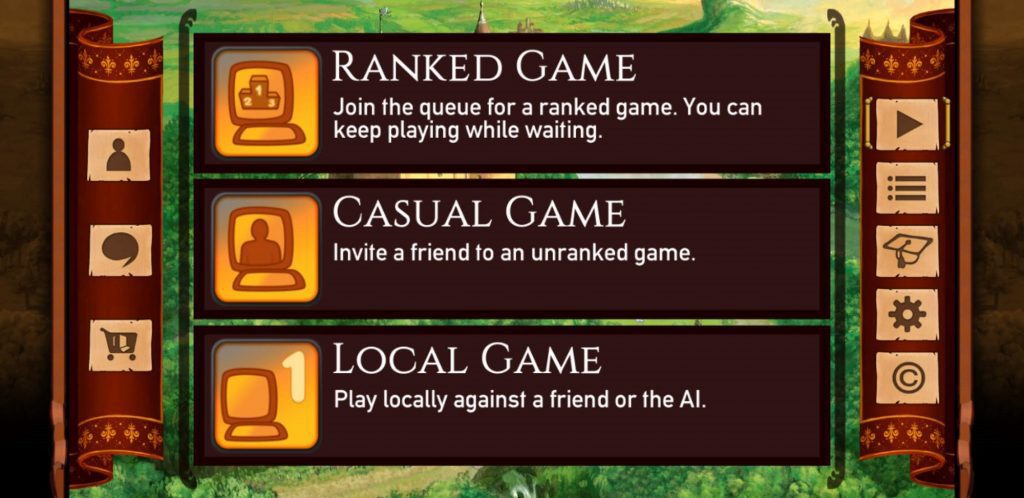
On the left side of the screen are three icons. One takes you to your account summary, one opens a chat window where you can review and continue previous chat threads, and the last takes you to another page where you can purchase other Digidiced products.
On the right side of the screen are links to game related material. At the top is the link to the landing page where games can be created. Beneath that is a link to view any open games that you might be part of, followed by a link to the tutorial, game settings, and credits.
Account Summary
On the Account Summary screen you’ll find five different tabs. Regardless of which tab you have open, you’re always going to see your profile picture, username, and generic stats shown at the top. Here you can freely change your avatar or edit your preferred username. To the right of this is a large power button icon which, when pressed, will cause the game to shut down and return you to your homescreen. The first tab contains your friends list as well as a people finder.
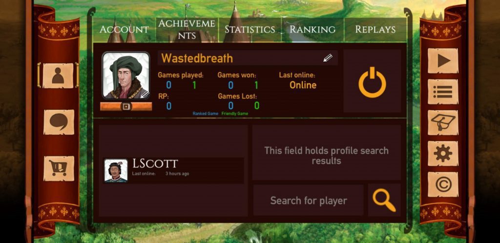
Clicking on your friend’s name will replace your profile with theirs as well as their own friends list. Each successive name that you click on will bring up that person’s friends list and their friends’ friends list, ad infinitum. To the right of each person’s profile is a plus sign that you can click on to add them to your friends list. If they’re already on that list, there will be a minus sign to remove them instead.
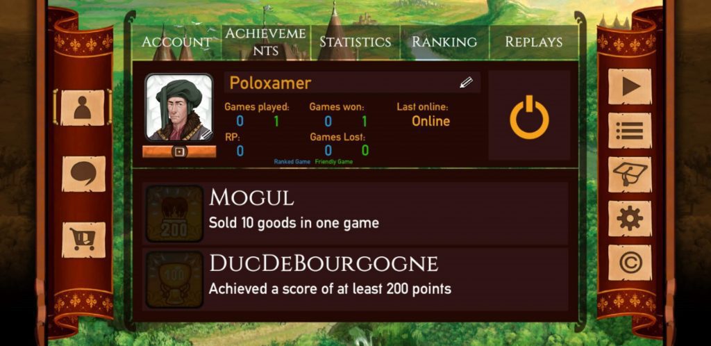
The second tab contains a list of achievements. While there are a few achievements listed here for you to try for, there are some that only appear when you’ve unknowingly achieved them. As a completionist and achievement hunter, I’m not a big fan of this setup. I want to see all of the achievements that are possible so that I can consciously pursue them if that’s what I choose to do. For instance, the two achievements shown in the image were the only ones available to me when the image was captured. Upon playing a game online for the first time, I was awarded an achievement for having played a game online. Why wasn’t that achievement shown from the get-go?
To the right of this tab is a tab showing some generic game stats such as how many matches you’ve played, games you’ve won and lost, etc. The next tab shows your overall ranking among other players as well as a list of the top 10 ranked players. Finally, to the right of this are your saved replays. Every game is saved as a replay by default, but this is an option that can be turned off when viewing the final game results.
Create Games
On the Create Games tab, you are presented with three different types of games that you can create: ranked games, casual games with specific people (unranked), or a local game against other people in pass and play fashion or against one or more of the AI.
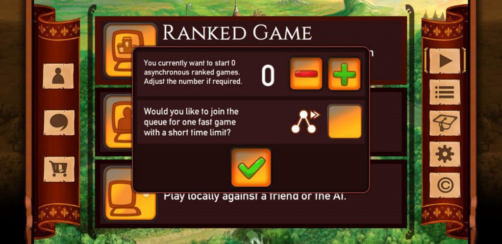
On the Ranked Game screen, you have two options: create a specified number of asynchronous games and/or join a live game with a short time limit. After making your selection, you’ll be placed into a queue for whatever you decided.
Casual and Local games look exactly the same. There is a list of current players on the left side of the screen and a box containing a list of any players that you are able to add. In Casual games, your friends are listed by their usernames, but you are only provided with a generic “Guest” in Local mode. You might notice from the image above that there are two options in the lower right: Shuffle and Map Mode.
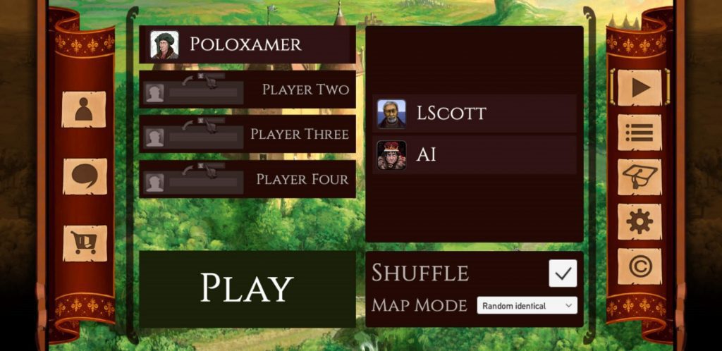
In the Castles of Burgundy app, player colors are determined by the players’ positions in the player list. The “shuffle” option will assign each player a random position and therefore, a random color as well. The Map Mode offers three different selections: Standard, Random Identical, and Random Different. Depending on your selection, you’ll either be playing on the standard estate layout, a random estate layout that matches your opponent’s, or a random estate layout that is different from everyone else’s.
Tutorial
The Castles of Burgundy app comes with a built-in tutorial that explains everything you need to know to play the game.
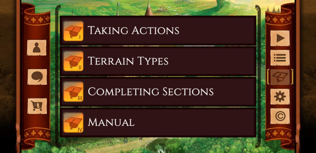
The tutorial is divided into several chapters. Each of these chapters presents new information about the in-game interface and how to navigate it as well as how to play the game itself.
Game Settings
The last tab is the Game Settings tab. This tab includes generic settings such as language selection and game speed settings as well as a toggle switch to turn the music on and off. There are also two extra toggle switches here labeled HD and FX, but there is nothing anywhere to indicate what those toggles actually do. There is also an area here where you can send feedback to the game developers about any bugs you might have found or any suggestions that you might have.
Thoughts
When I first fired up the Castles of Burgundy app for Android, I did my best to go into it with an open mind. Having seen some screenshots of the new artwork and the revamped layout, I was hesitant. I really like the look and style of the physical board game and like many people, I’m not super quick to readily embrace change… especially when the thing that’s being changed is already very functional as it currently is. It wasn’t easy to set aside my biases, but I tried my best. Here are a few things that I was particularly impressed by:
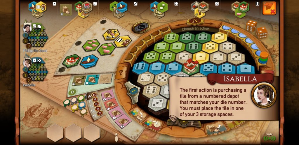
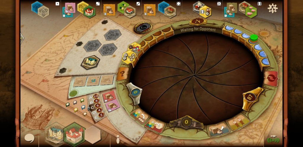
In all of the web-based implementations of this game that I have encountered, the desire to remain as true to the physical board game as possible has always resulted in the developers making some of the same decisions when it comes to which information to display on the screen and which information to keep hidden; particularly when it comes to showing which tiles are available for purchase and which tiles have been moved into the various depots. In the physical board game, this information is displayed on a central board that sits between the players.
In web-based versions, though, the focus is normally on the player’s estate and this information is hidden in pop out, accordion style menus along one of the borders of the screen. This style of implementation, while fully functional, isn’t always the easiest to use and you sometimes find yourself having to open and close things multiple times in order to compare those items to the board state.

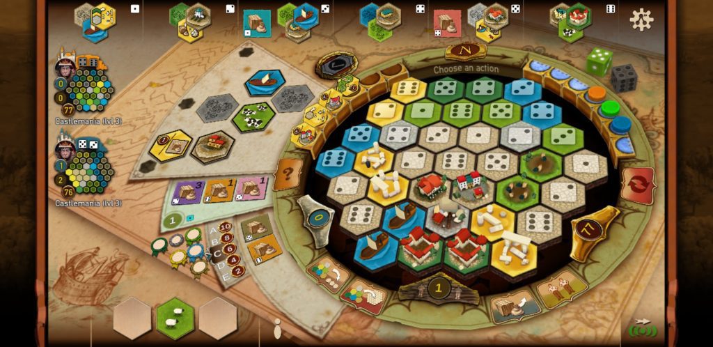
In the new layout, all of the depots are listed across the top of the screen along with any tiles that may have been placed into them. Having this information clearly visible at all times serves to make the app experience much better than web-based versions. I wasn’t a big fan of this at first, but it’s gradually grown on me. I like being able to see all of my options without having to go hunting for them.
The music is this game is also done very well. It has a very Renaissance Faire feel about it which is very appropriate given the time frame in which the game’s events take place. I didn’t listen to it for very long, though. As thematic as it is, it does become very repetitive after awhile. I can only tolerate it in small doses. Because I rarely play games on my device while wearing headphones, I tend to play my games with all of the volume levels set as low as they can go, so you can take that for what it’s worth.
Another thing that I like about the new interface is the way that the knowledge tiles are displayed in a semi-circle along the left side of the estate area. In other implementations, the effects of these tiles are handled for you automatically, but you’ve got to keep tabs on which tiles you’ve actually placed yourself. When your estate starts getting crowded, gathering this information together can takes a few seconds as you pick out the yellow tiles from everything else.
Having them all gathered together in one place gives you ready access to that information and helps you make faster, more informed decisions. There is a secondary reason for the developers to do this, though, and I’ll get to that momentarily because while the Castles of Burgundy Android edition does a lot of things very well, it also has several shortcomings.
For starters, let’s talk about the tutorial. As robust and useful as it is, I feel like they really missed an opportunity with it.
The first thing that I did with the app was to head to the tutorial and run through all of the chapters. Overall the tutorial is very well done, but I wish it had also provided a tutorial about navigating the app outside of the game environment. For instance, when I first started playing the game, I found myself getting very irritated by one very specific thing. I was playing multiple asynchronous four player games at the same time. Each time I received a notification that it was my turn, I would fire up the game and be forced to sit there watching each player take their animated turn. If there was a new Phase somewhere in there, I had to sit through that, too.
Even at the fastest game speed, these animations still feel like they take forever. In the very bottom left corner of the Running Games tab is a checkbox labeled “Watch Replay”. One day I got curious about what would happen were I to remove the checkmark and, miraculously, the animations came to an end. Now I could just hop right into the game and take my turn! If the tutorial had guided me through the app functionality, I could have saved myself a lot of time and headaches.
Speaking of animations, that reminds me of another small irritation. Whenever you enter into a game, you are presented with a screen that looks like this:
The metal blades, accompanied with a metallic scraping sound, retract and your estate rises from the depths. When you switch to another player’s estate, this same animation plays in reverse with the same sound effect. While this is undeniably a really clever animation, the whole steampunk feel of it seems very inappropriate in a game like The Castles of Burgundy which takes place in a far less technologically advanced setting. That coupled with the fact that you’re forced to watch the animation multiple times in a row (especially in live games where you don’t have the option to skip it) make me not care for it very much. It seems superfluous and I wouldn’t complain if it were removed entirely.
Now, I’d mentioned the depots earlier and hinted that not everything about them was perfect. The reason I say this is that because of the new artwork, almost all of the iconography has changed. This won’t be a big deal for people new to the game, but for people like me that have been playing The Castles of Burgundy for a very long time, this change takes a lot of getting used to. To further complicate things, once a tile has been removed from the depot and placed into the estate, that tile is replaced by a 3D version of the tile. This can be very problematic as some of the buildings in 3D form look very similar to some of the building tiles in their flat format, but they’re not the same buildings.
There have been multiple times that I have grabbed a tile from a depot with the intention of playing it only to discover that I’d already played that tile into my estate in the region that I was intending to place the newly drawn tile into. So, I not only wind up having a wasted turn, I also wind up with a tile that I can’t do anything with. If this all happens on the same turn, there’s no harm done because you always have the option to rewind your entire turn (which would be much better if you were also allowed to just rewind a single play as opposed to the entire turn). But if this is not the case, then oh well. Bad luck for you. Incidentally, this is also the reasoning for displaying the obtained knowledge tiles alongside the board. When you place a knowledge tile into your estate, it is replaced with a Stonehenge-like structure that imparts zero useful information about the tile’s functionality.
The only other negatives that I can find with the app are fairly negligible things. You can’t change your player color voluntarily and there’s no way to fast forward through replays if you’re just trying to see what the end result was in an older game. While none of these are game changers in any way, they all come together to generally leave a sour taste in my mouth for what is otherwise a fantastic app. The game plays great and everything’s well organized, but all of the animation and 3D stuff just annoys me. If I were given the option to turn it all off, then I would do so in a heartbeat and I’d be telling you about how amazing this app is and how you absolutely need it in your life, especially if you’re already a fan of the physical board game. Alas, those options do not exist so all I can leave you with is this: for a Castles of Burgundy app, this is a good app, but it isn’t a great one.
The Castles of Burgundy details

- Designer: Stefan Feld
- Artists: Harald Lieske, Julien Delval
- Publishers: alea, Broadway Toys LTD, Giochi Uniti, Grow Jogos e Brinquedos, Hobby World, Maldito Games, Ravensburger, Ravensburger Spieleverlag GmbH, Rebel, Rebel Sp. z o.o.
- Release Date: 2011
- Player count : 2 - 4
- Age range : 12+
- Time range : 30 - 90 minutes
- Mechanism(s): Dice Rolling, End Game Bonuses, Grid Coverage, Hexagon Grid, Pattern Building, Set Collection, Tile Placement, Turn Order: Stat-Based, Variable Set-up, Worker Placement with Dice Workers
- BGG Geek Rating: - converted to Meeple Mountain scale: .
- More articles about The Castles of Burgundy.


Hi,
you can turn Gameplay soeed to fast to get rid of the character animations and speed things up.
Great observations. But none are my own biggest disappointment, and that is the AI. Having owned the physical tabletop version for less than a month, I’m by no means anything close to an expert at the game. End yet having played the app multiple dozens of times in the last week vs the AI, at all player counts, with a mix of AI strengths but always including one at the strongest Level 3, I remain undefeated, and most games aren’t even close, with a spread of 30-40 points. I was hoping it would offer more of a challenge. As it is, it really just useful as a tool to learn the game and not much more.