“You never get a second chance to make a good first impression.” – Will Rogers
If you are browsing through your friendly local game store, or through the game listings at BoardGameGeek, chances are that your initial introduction to a board game comes from the artwork on the box. The cover, the sides, and the back of the box all need to engage with you—draw you in, spark something in your imagination—in order to entice you to part with hard earned cash. As with anything, some games have wonderful artwork (the good), some games have awful artwork (the bad), and still others have artwork that makes you scratch your head wondering why (the ugly). Today, K. David Ladage and Joseph Buszek each look at three games which fall into those buckets and let you know which games might be worth your time but are hiding behind the wrong first impression, and which peaked with the box.
Joseph Buszek
The Good – On Mars
I can’t think of a board game designer and artist more closely linked than Vital Lacerda and Ian O’ Toole, who have collaborated on eight big box titles for Eagle-Gryphon Games. Of all the gorgeous covers created by O’ Toole for Lacerda, On Mars still grabs my top spot. The stark red and green color scheme, stylized text, and hazy, dust-swept perspective matches the theme of the game to perfection. It simultaneously evokes the inconceivable vastness of outer space and the isolated, desolate existence on the surface of Mars. The single, solitary astronaut clearly working a difficult, bleak, and lonely job while his ship hovers far off in the distance. It’s absolutely incredible.
Here’s the kicker, though: I actually don’t enjoy this game, like, at all. For me, the gameplay mechanics are unnecessarily complex for what is essentially a pick-up-and-deliver, worker placement game. But something happens every time, without fail, that I come across this box on the shelf at my local game store or on the table at a convention. I think to myself “I should give On Mars another try”, despite knowing that I have played it several times and I know that I don’t like it. This, to me, is what separates On Mars from other excellent box art: it is so exceptional that I’m willing to ignore my past experiences and somehow wind up engaging in an excruciating test of patience for the next 4+ hours. Curse you, Ian O’ Toole!

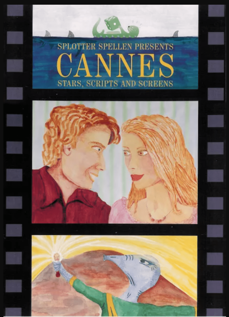
The Bad – Cannes: Stars, Scripts and Screens
I could probably have chosen from several titles from Dutch publisher Splotter Spellen. Their reputation for obsessed devotees to their games is matched only by the terrible art that graces their boxes. Bus is a deep strategy game that looks like it belongs on the HABA children’s shelf. Roads & Boats should be used in a graphic design class as a cautionary example of terrible text layout. But for straight, all-around eye sores, no game (from Splotter or otherwise) comes close to the disaster that is Cannes: Stars, Scripts, and Screens.
Cannes, the film festival, is synonymous with cinema as high art. Films with character depth and created by auteurs. Cannes, the board game, looks like it was drawn by an 8-year-old with questionable talent. The couple in the center are pure nightmare fuel, with hypnotically strange mouths and those dead eyes staring intensely and uncomfortably at one another, conveying dread much more than the romance they were clearly going for. I’ve looked at this thing for so long and still have no clue what film the alien/aardvark wizard, emitting some sort of light or substance from their potion/wand/turkey leg, in the bottom image is meant to represent.
If not for the film strip perforations on the sides of the box, who would ever guess this game is about movie-making? Nobody, that’s who. Also, if you’re going to include the sprockets, don’t then use crude, colored-pencil drawings to fill the space in between them instead of, you know, actual film images. It all makes no sense. Please just send this one away. I can no longer stand it.
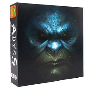
The Ugly — Abyss
In theory, I completely understand what the production is going for and I’m generally a proponent of minimalist design. Say less and grab the viewer’s attention with a singularly-focused, striking image. It’s actually very creatively illustrated by a proficient artist. For me, though, Abyss doesn’t grasp the difference between being mysterious and simply confusing.
First off, what’s the name of this game? No idea-it’s not on the front of the box. If the idea was that I’ll be so enthralled by the image alone that I will want to grab it off the shelf to find out, it fails there. I’m sorry, but the angry, beefy, Smurf-on-steroids staring at me menacingly does nothing to make me question my level of engagement. Secondly, what’s this game about? Am I supposed to guess it’s an Avatar-aping, underwater-themed card drafting and set collection game, based on the barely-visible, out-of-focus bubbles around this dude’s ugly mug?
If all of that seems confusing, fear not! They also released the game with several other versions of the cover. If the Smurfs aren’t your thing, perhaps one with a thinly-veiled rendition of Thanos, the Ninja Turtles, or the musical Cats, are more up your alley? They even made one with the actual name of the game on it. Rest assured, there’s a box of Abyss for you, any of which will do absolutely nothing to answer your questions about what the game is or how it plays. Congratulations!

K. David Ladage
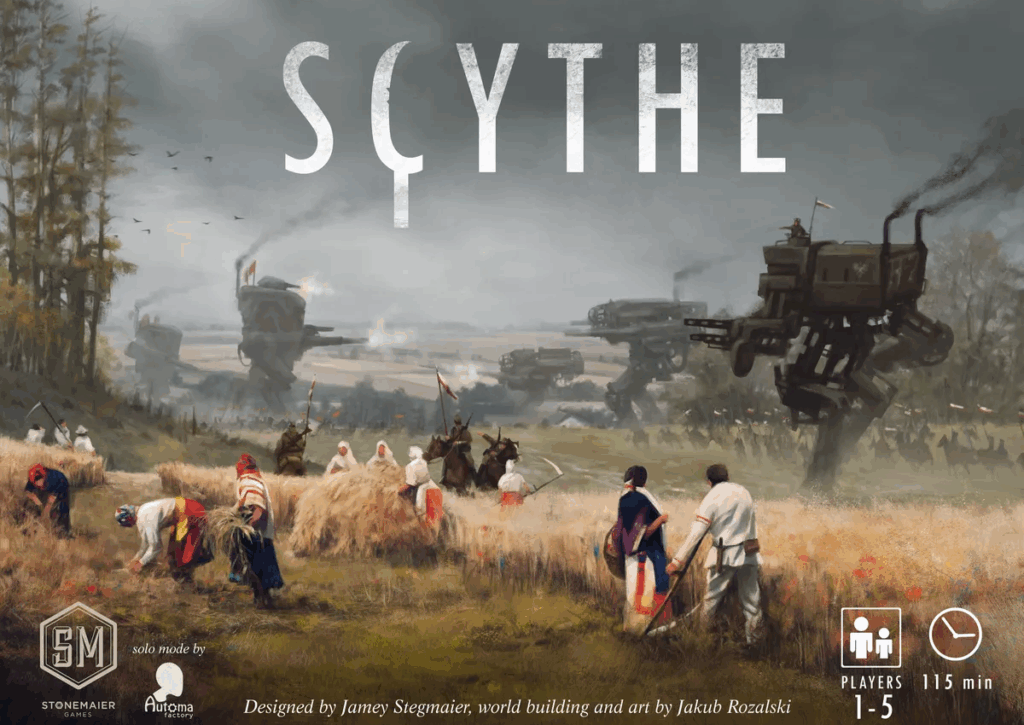
The Good — Scythe
In my very humble opinion, the art used on a board game’s box needs to be evocative of the contents.What am I about the play? What sort of game is it? Is this something my game group might like to see on the table on a regular basis? Many board games do very well in this area! Few have the insane level of quality that went into the artwork used in Scythe.
Note how the mechs are present and feel like they are not futuristic at all—they might even be coal-powered! The background indicates that conflict is certainly a part of the game, and mechs are the heavy hitters. But look at the number of horse cavalry riding alongside. They remain a big part of the force, not tanks or even armored personnel carriers. And yet, even with all of this happening, foreground focus is on the harvest taking place. Nothing from John Deere is here, no giant corporate farm machinery, just a group of people gathering their grain as a couple of horse cavalry officers monitor things.
The official name of the setting is 1920+. This box captures so much that is intriguing, interesting, and inviting. And it is true to the game! Yes, mechs can get into fights, but that is not the focus. The focus is on the economic engine that can be put together as you navigate a world where science took a hard left turn at some point. The quality of the artwork extends beyond the box and permeates every aspect of the game’s production.
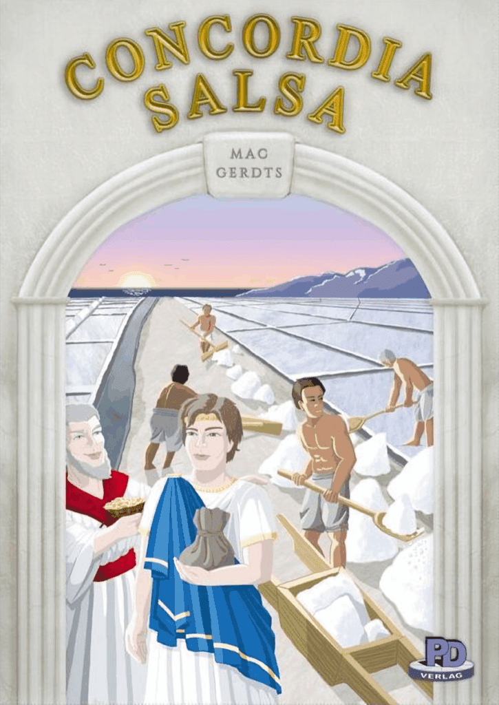
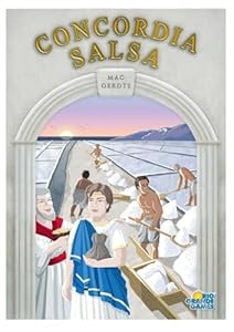
The Bad — Concordia Salsa
There is a scene in the movie This is Spinal Tap, where the band finally realizes that their idea of having an all jet-black album cover with jet-black text was not going to work. When I look at the various shades of white on the Concordia Salsa box art, I see that they included some other colors and ensured that the text was legible… but the whole thing is as interesting as a plain white box.
The truly sad part of this is that Concordia is a great game! And Concordia Salsa is an excellent expansion. The Concordia box art was serviceable, but not exceptional. The artwork on this expansion, however, was just plain terrible. Nearly everything is off-white; what isn’t is mostly muted to the point of being nearly indistinguishable from gray. The clothing on the workers is off-white, and they are supposed to be working with salt – something I would advise not going bare chested. Were it not for the splashes of red and blue on the two people not working, the only actual color on the box would be the gold title.
Fortunately, the good people in charge of this line of games saw fit to release it with updated artwork later… The art used then was not great, but it was a vast improvement over the bland monotonous tones of this box. I mean, when I look at this, all I can think is “hard no.”
The Ugly — Power Grid
In this series, The Ugly refers to something that just should never have happened. It is not that it is particularly bad, per se, but it went in a direction that leaves you scratching your head and wondering why anyone would do this. In our previous entry in this series, we looked at a couple of games that begged the question: “Why would you make a two-player version of that game?” For this one, the question is: “Why would you choose to do this when making box art?”
Power Grid is an amazing game worthy of all the praise that has been heaped upon it over the years. Each new map manages to tweak this or that while keeping the game fundamentally the same. It is a master class in game design. So one has to wonder why the box art is evocative of the most boring job imaginable. Imagine if the cover of a game about business decided to use an image of a secretary answering the phone while typing a nondescript document on an old manual typewriter. “So,” you think to yourself, “this game is about administrative duties, then?”
That is the vibe of the box art for Power Grid. If you knew nothing about this game and saw the cover, at most you might assume that the game was a simulation of doing bookkeeping or maintenance for a power plant. “OK, it is my turn. I adjust the heat regulators on boiler number four by two degrees celsius.” How exciting.
Honestly, this is the ultimate example of the adage “do not judge a book by its cover” as applied to board games.

Final Thoughts
Board game publishers need to consider the impact of that first visual contact with the customer. If the artwork on the box does not engage with them, then a sale is potentially lost. If the artwork on the box suggests a game that is not realized by the components and rules, then a customer might be lost forever because they purchased a game that did not live up to the expectations set by that first glance.
Many times, box covers feel like an afterthought, haphazardly slapped on at the last-minute because of budget concerns or laziness. Other times it seems too overcooked, like it was created by a random focus group, using ideas and visuals from other sources to appeal to a specific demographic. Either way, the end result lacks anything that would make it stand out in a positive way. When they get it right, however, it can be sublime. Something you want to display. Like a great book or album cover, it’s an invitation to a journey you hope to take.
Fortunately, in the era of modern board gaming, we have a plethora of online resources (e.g., BoardGameGeek, Meeple Mountain) to aid us in seeing beyond the box. It is our goal to help you avoid pitfalls and to discover gems hidden behind poorly-thought-out graphic design. We try to give games a chance even when our initial reaction is less than stellar. We try to warn our readers when the latest big, shiny release is more smoke than substance.
Let us know if we are succeeding – and what we can do better – in the comments.






I have never seen or heard of “Cannes: Stars, Scripts and Screens”. And now I can’t un-see it. Almost makes Hansa Teutonica and Concordia’s box art acceptable, except it doesn’t.